Radish
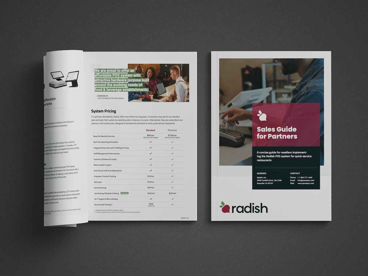
Radish is a QSR-native point-of-sale and payments platform built for the realities of modern quick-service restaurants. Founded in 2018 as Parse Pay, the company earned its stripes solving hard problems in restaurant payments—including developing TrueMargin™, a patent-pending pricing technology created in response to industry-wide regulatory changes—before rebuilding its platform around an agentic AI core in 2025. As co-founder and Chief Product Officer, I lead product strategy and serve as the company's sole UI/UX designer.
Project Overview
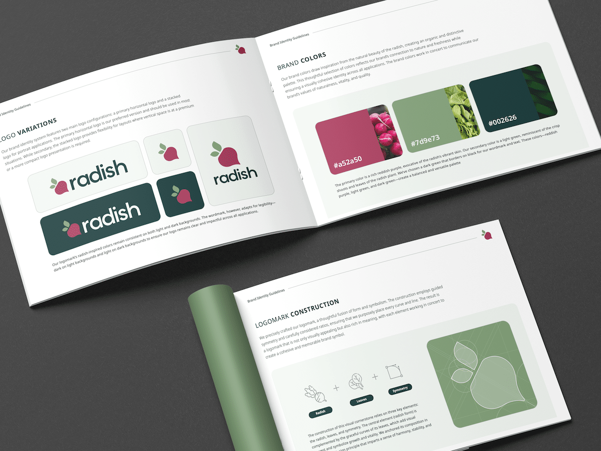
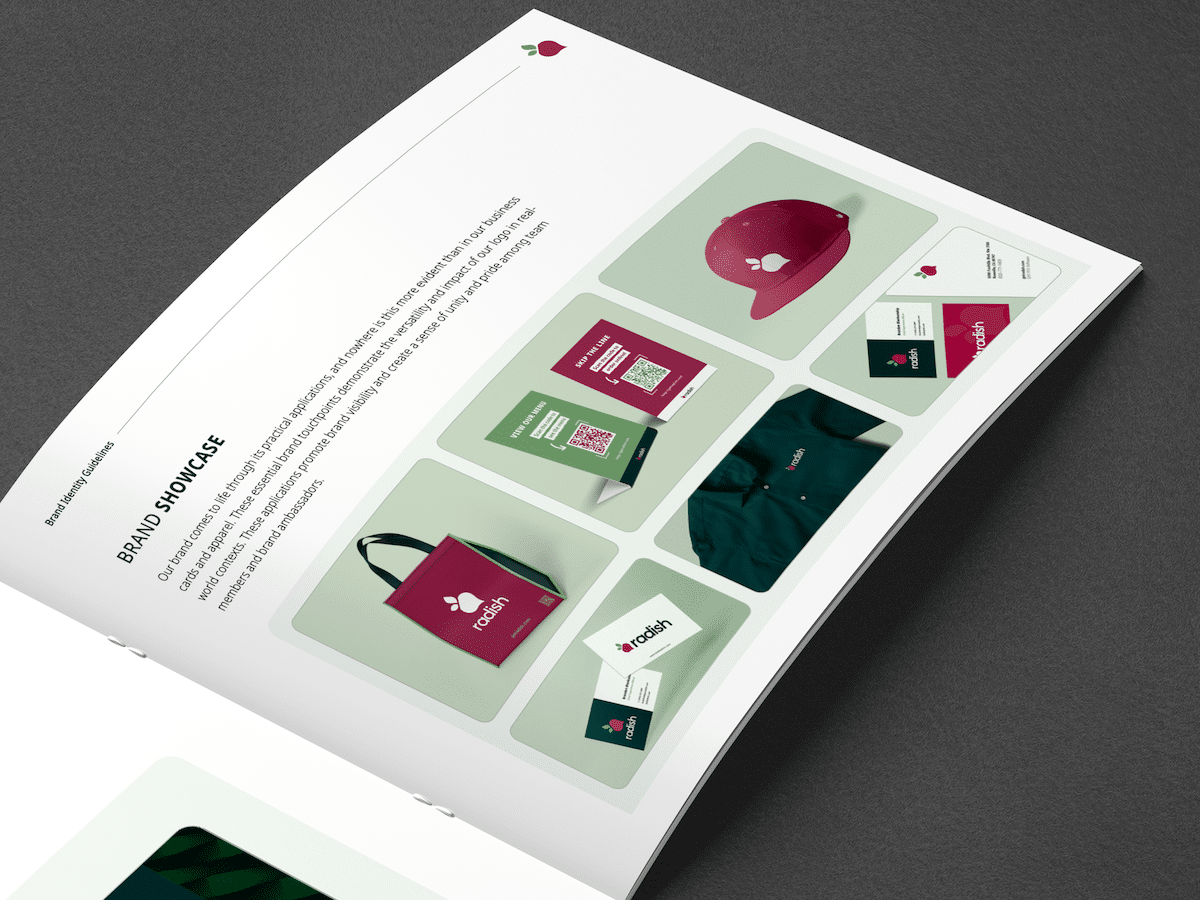
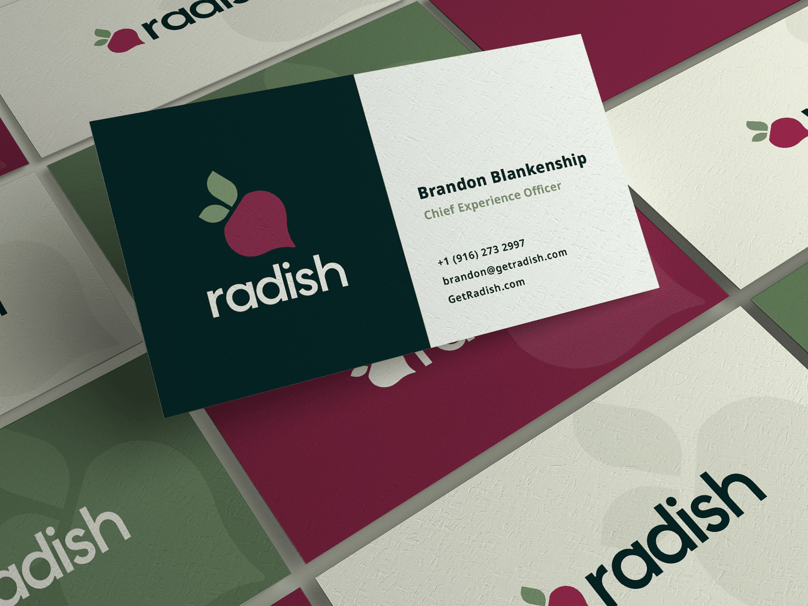
In 2025, the company rebranded from Parse Pay to Radish, and I led the identity work from naming rationale through final brand guidelines. The rebrand was about more than a new logo: Parse Pay's name spoke to payments processing, but the company had evolved into a full restaurant technology platform, and its identity needed to resonate with the quick-service industry it serves. "Radish" captures the qualities we wanted the brand to embody—growth, freshness, and approachability—while being distinctive and easy to remember. The new logomark distills the radish to its essential form, constructed with guided symmetry and deliberate ratios, and paired with a clean, uncluttered wordmark. The color palette is drawn directly from the vegetable itself: a rich reddish purple, a light leafy green, and a near-black dark green anchoring the wordmark and text. I developed the complete identity system—primary horizontal and stacked lockups, mono-color variations, and safe-zone specifications—and documented it all in a comprehensive brand guidelines book covering everything from logo construction to real-world applications like signage, apparel, and business cards.
Project Scope
Project Showcase